loading效果

1
2
3
4
5
6
7
8
9
10
11
12
13
14
15
16
17
18
19
20
21
22
23
24
25
26
27
28
29
30
31
32
33
34
35
36
37
38
39
40
41
42
43
44
45
46
47
48
49
50
51
52
53
54
55
56
57
58
59
<!DOCTYPE html>
<html>
<head>
<meta charset="utf-8" />
<title>CSS3动画实现loading效果</title>
<style type="text/css">
*{
margin: 0;
padding: 0;
}
.circlebox{
width: 40px;
height: 40px;
margin: 100px;
position: absolute;
}
.circlebox p{
width: 12px;
height: 12px;
border-radius: 50%;
background: red;
position: absolute;
animation: move 1.5s infinite linear;
}
.circlebox p:nth-of-type(1){left: 0;top: 0;}
.circlebox p:nth-of-type(2){right: 0;top: 0;}
.circlebox p:nth-of-type(3){right: 0;bottom: 0;}
.circlebox p:nth-of-type(4){left: 0;bottom: 0;}
.circlebox:nth-of-type(2){transform: rotate(45deg)}
@keyframes move{
0%{transform: scale(0);}
50%{transform: scale(1);}
100%{transform: scale(0);}
}
.circlebox:nth-of-type(1) p:nth-of-type(1){animation-delay: -0.1s;}
.circlebox:nth-of-type(2) p:nth-of-type(1){animation-delay: -0.3s;}
.circlebox:nth-of-type(1) p:nth-of-type(2){animation-delay: -0.5s;}
.circlebox:nth-of-type(2) p:nth-of-type(2){animation-delay: -0.7s;}
.circlebox:nth-of-type(1) p:nth-of-type(3){animation-delay: -0.9s;}
.circlebox:nth-of-type(2) p:nth-of-type(3){animation-delay: -1.1s;}
.circlebox:nth-of-type(1) p:nth-of-type(4){animation-delay: -1.3s;}
.circlebox:nth-of-type(2) p:nth-of-type(4){animation-delay: -1.5s;}
</style>
</head>
<body>
<div class="circlebox">
<p></p>
<p></p>
<p></p>
<p></p>
</div>
<div class="circlebox">
<p></p>
<p></p>
<p></p>
<p></p>
</div>
</body>
</html>
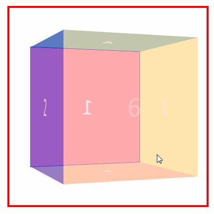
旋转立方体
1
2
3
4
5
6
7
8
9
10
11
12
13
14
15
16
17
18
19
20
21
22
23
24
25
26
27
28
29
30
31
32
33
34
35
36
37
38
39
40
41
42
43
44
45
46
47
48
49
50
51
52
53
54
55
56
57
58
59
60
61
62
63
64
65
66
67
68
69
70
71
<!DOCTYPE html>
<html>
<head>
<meta charset="UTF-8">
<title>CSS3实现立方体</title>
<style type="text/css">
*{
margin: 0;
padding: 0;
}
.box{
width: 400px;
height: 400px;
border: 4px solid red;
margin: 30px auto;
perspective: 1000px;
}
.box ul{
width: 300px;
height: 300px;
border: 1px solid blue;
margin: 50px auto;
position: relative;
transform-style: preserve-3d;
animation: move 4S infinite linear;
transform-origin: center center -150px;
}
.box ul li{
width: 300px ;
height: 300px;
list-style: none;
font-size: 50px;
color: #fff;
text-align: center;
line-height: 300px;
position: absolute;
}
.box ul li:nth-of-type(1){background: red;opacity: 0.4;}
.box ul li:nth-of-type(2){background: blue;opacity: 0.4;transform:translateX(300px) rotateY(90deg); transform-origin: left;}
.box ul li:nth-of-type(3){background: yellow;opacity: 0.4;transform:translateX(-300px) rotateY(-90deg); transform-origin: right;}
.box ul li:nth-of-type(4){background: green;opacity: 0.4; transform: translateY(-300px) rotateX(90deg); transform-origin: bottom; }
.box ul li:nth-of-type(5){background: darkorange;opacity: 0.4;transform: translateY(300px) rotateX(-90deg); transform-origin: top; }
.box ul li:nth-of-type(6){background: pink;opacity: 0.4;transform: translateZ(-300px) rotateY(180deg);}
@keyframes move{
from{transform: rotateY(0);}
to{transform: rotateY(360deg);}
}
</style>
<!--
1.定位
2.移动物体位置 transform: translate 平移
rotate旋转 X水平的轴 Y表示垂直的轴 Z表示屏幕垂直的轴
3.3D场景的设置
transform-style:perserve-3d;是需要添加到所有变形元素的父元素上
perspective:1000px 景深 看物体远近 数值大小表示远近 越大越远
4.动画animation 动画的轨迹是写在keyframs 里面
-->
</head>
<body>
<div class="box">
<ul>
<li>1</li>
<li>2</li>
<li>3</li>
<li>4</li>
<li>5</li>
<li>6</li>
</ul>
</div>
</body>
</html>